O Jewelers Branding
General Description
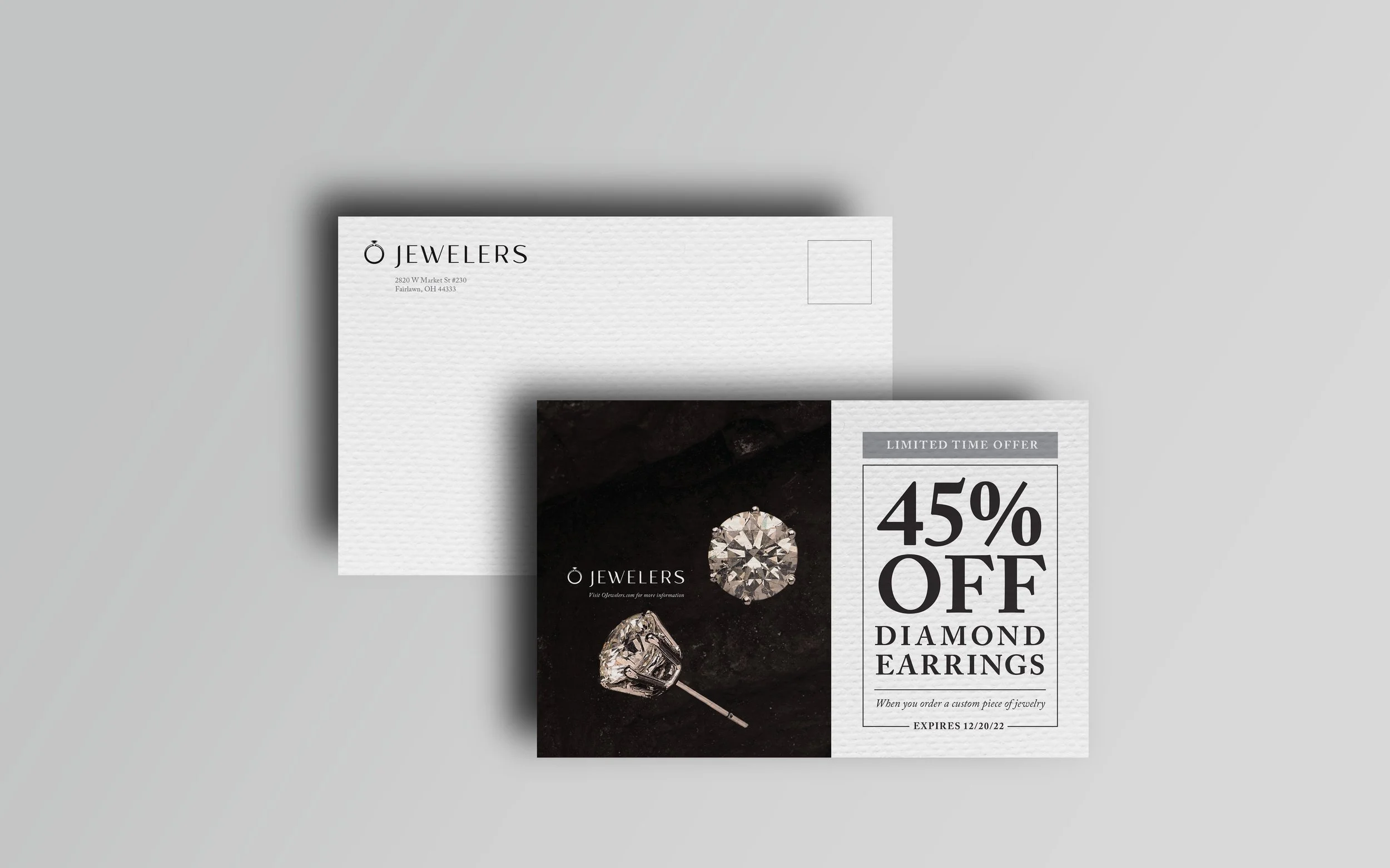
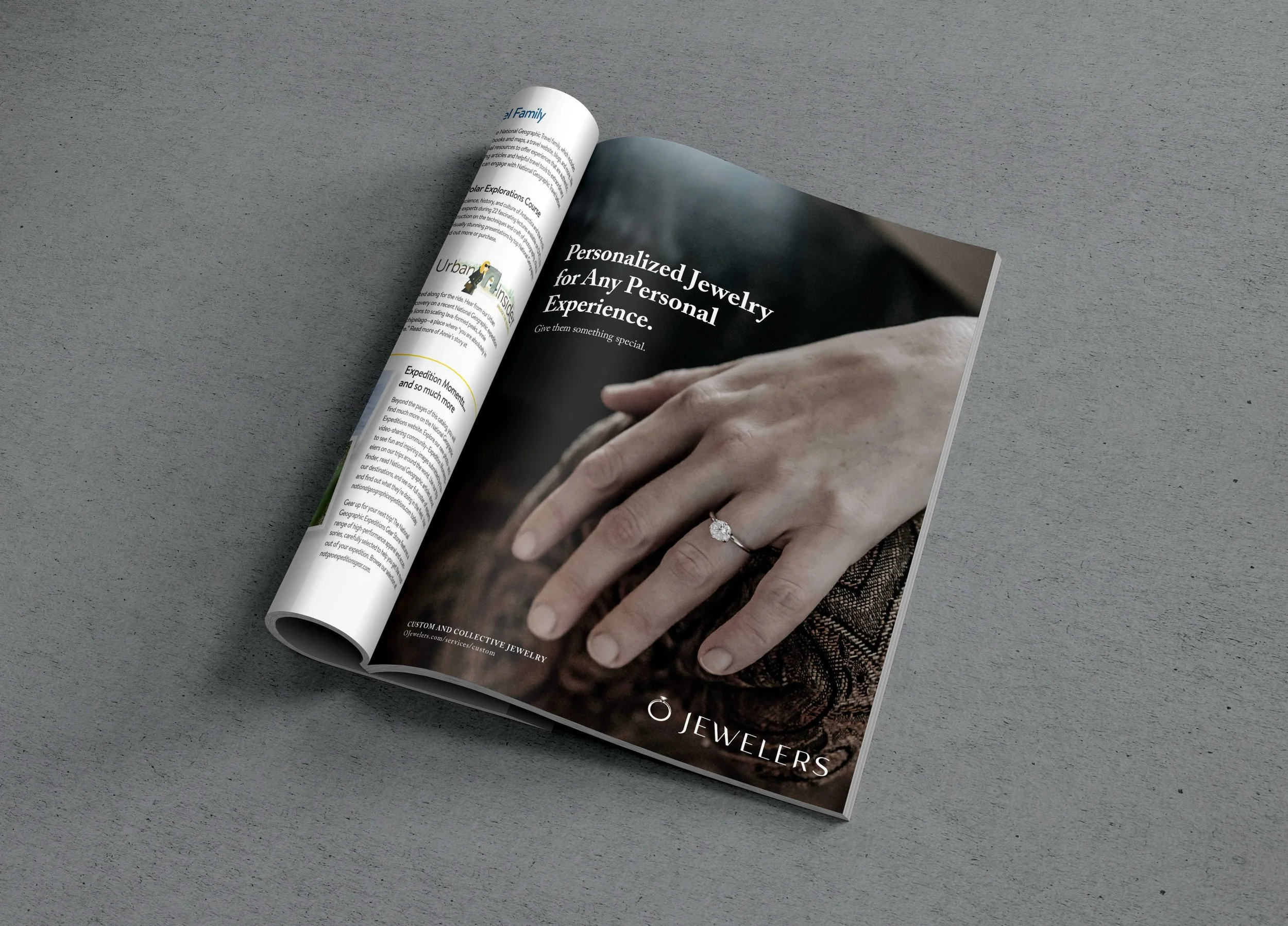
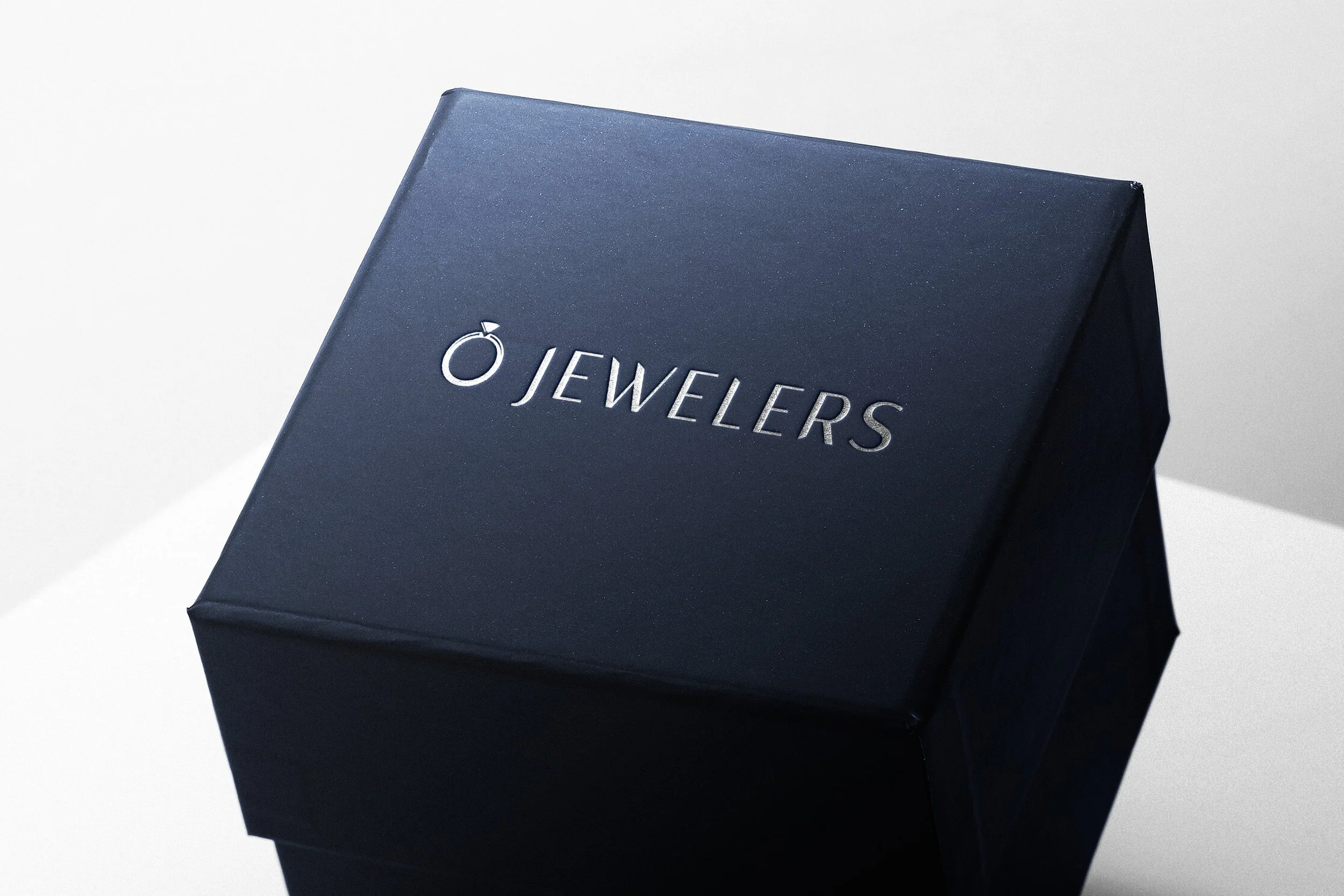
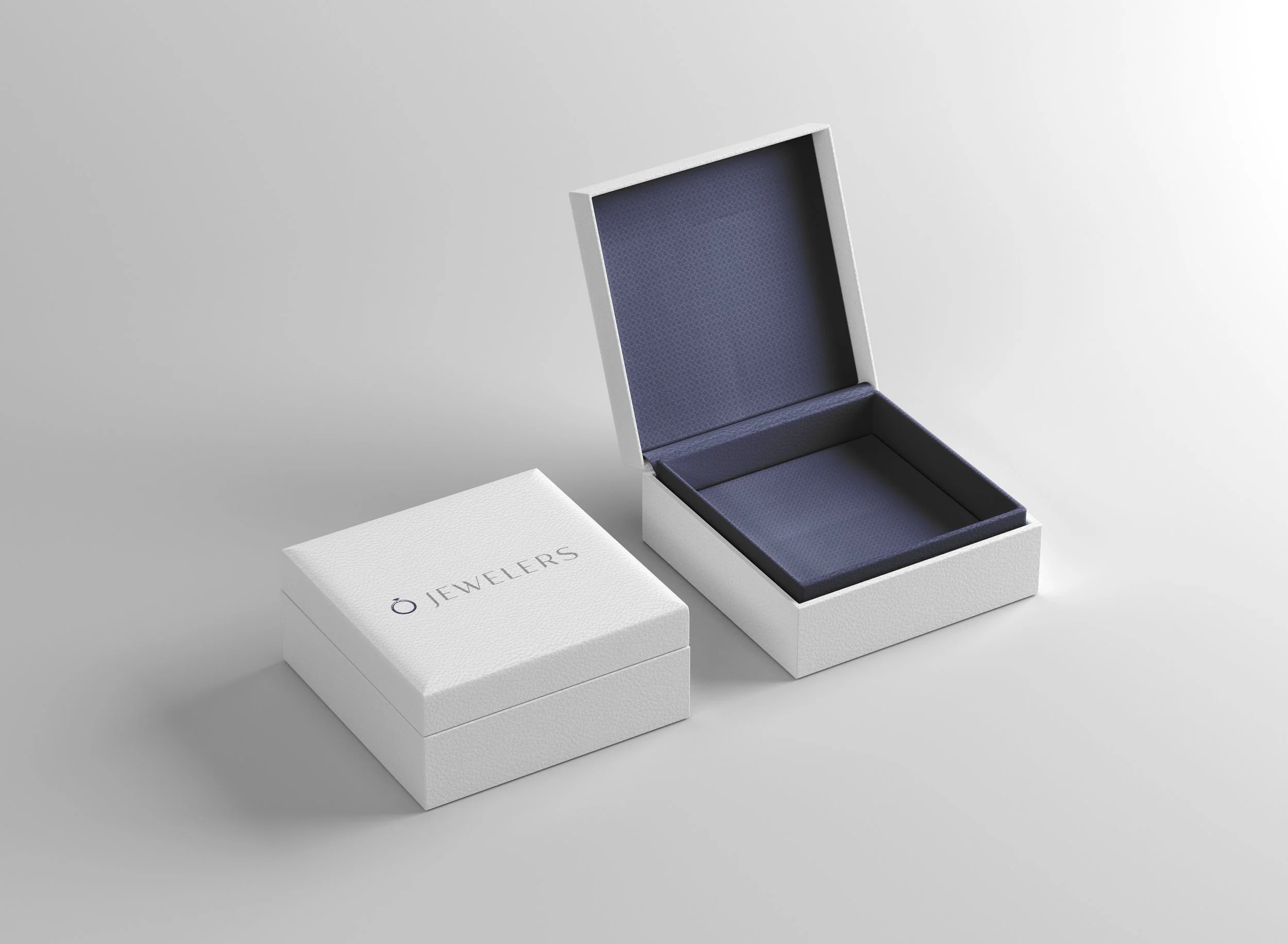
For this project, I was tasked to redesign an entire brand identity for a local company, or companies, whose brand needed an update. We were also allowed to redesign more than one company logo, so I did two companies. I chose a Jewelry company that is originally known as "MJO Jewelers." I chose to rename it "O Jewelers" because “O” is the owner's initial of his last name and it fits well for a ring theme. I modernized their logo by using a clean-cut typeface paired with a symbol that signifies a ring as well as the letter "O". Most of the jewelry made at this company involves white gold/silver and blue gemstones. The colors gray and navy blue represent this well and separate them from their competitors because it is not the usual gold, or black color scheme. The deliverables needed for this project were collateral ads, promotional ads, website pages, a letterhead system, and extra miscellaneous applications that fit the brand.
Client
Myers School of Art: Corporate Identity
Role
Designer
Technique
Adobe InDesign, Illustrator and Photoshop
Year/Medium
Fall 2022, Digital


